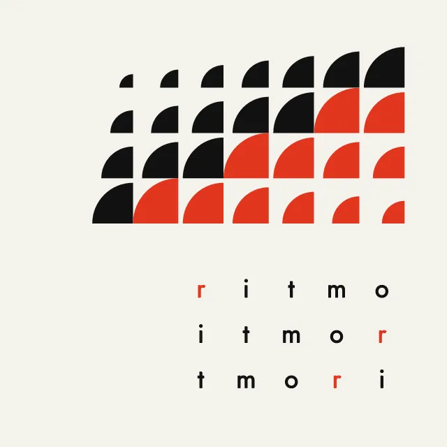
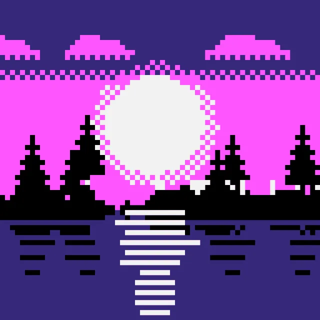
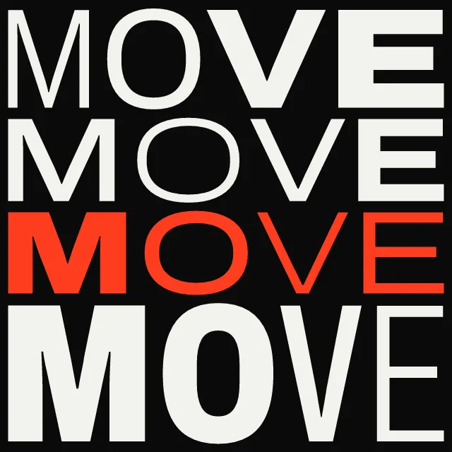
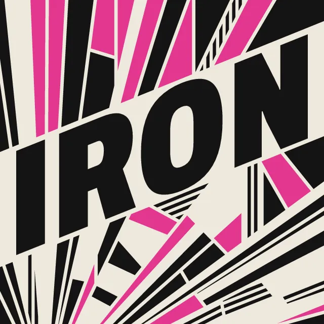
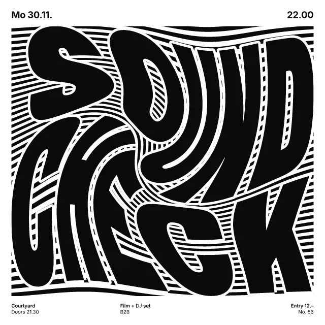
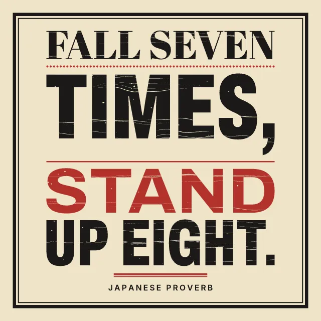
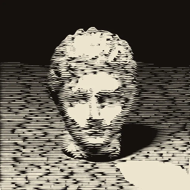
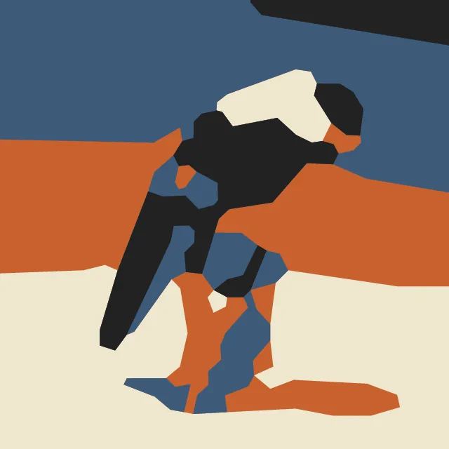
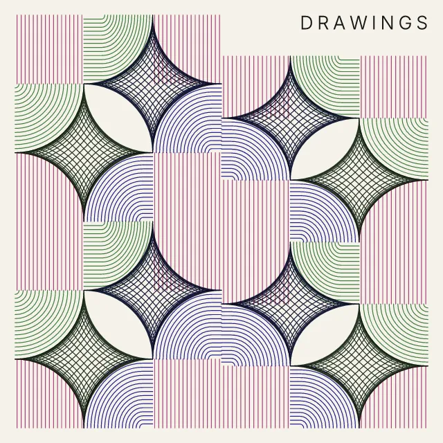
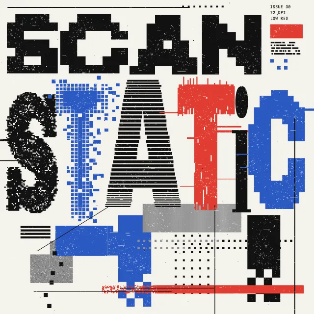
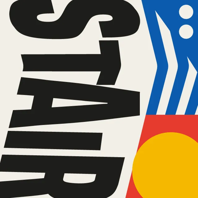
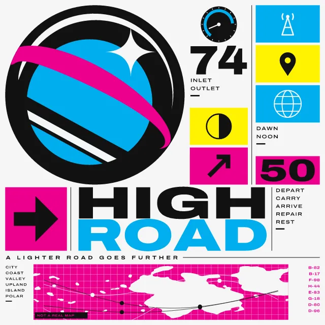
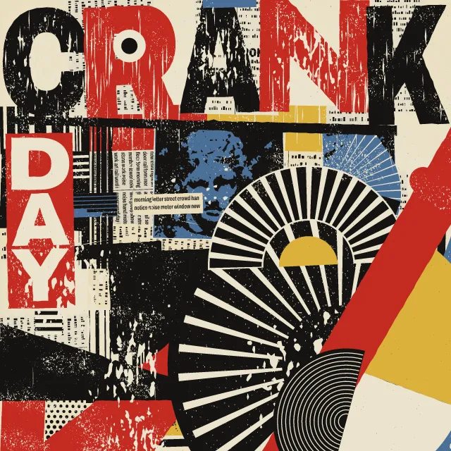
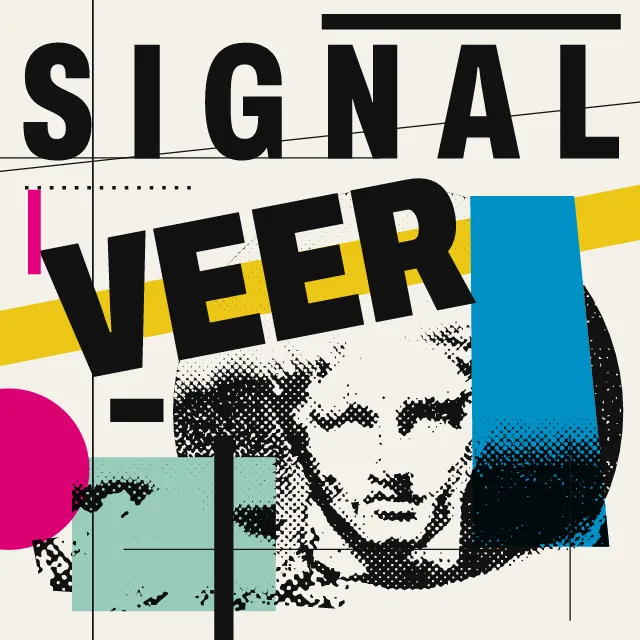
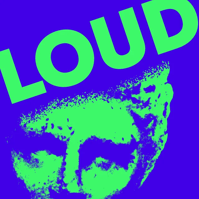
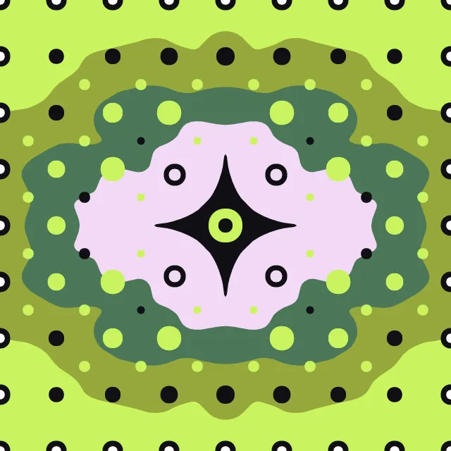
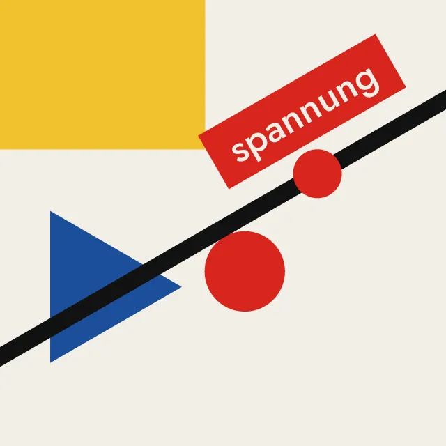
Your title word drawn up tall until it fills the sheet, its letters or the ground around them screened with lines that step, grade or swell. One or two flat inks.
What makes it Di Tella
These are the design choices this generator makes or lets you set. Where a choice says “Measured”, Morphogeny changed that control alone, kept everything else, and measured the picture: a number that moves with the choice, not proof that the picture reads as the style.
- Letters so large they become the picture. Set by “Type as image”.
- Letters and lines crowded together, touching or overlapping. “Type as image”: Stacked.
- Image or colour runs off every edge; no protective margins. “Type as image”: Cut by the edges.
- Lines set at angles, stacked or running vertically. “Type as image”: Turned.
- Repeated lines and modules that vibrate or warp perception. Set by “Optical pattern”.
- Composition driven by tilted axes and oblique movement. “Line direction”: Diagonal. Measured on the opening picture: edges on the diagonal 59% with “Diagonal”, 5.4% with “Across the letters” and 1.3% with “Along the letters”.
- Repeated units create a visual cadence. Set by “Repetition & rhythm”. Measured on the opening picture, from 16 to 80: pixels on an edge 22% → 40%.
- Two or three flat inks. Set by “Limited spot colours”.
- A single hue, or black and white. “Limited spot colours”: One ink. Measured on the opening picture with “One ink”: hues besides black, white and grey 0.
- Asymmetric, unjustified text setting. Set by “Facts block”.
- Tall, narrow, heavy letters for impact. Always.
- Neutral, rational sans: Akzidenz-Grotesk, Helvetica, Univers. Always.
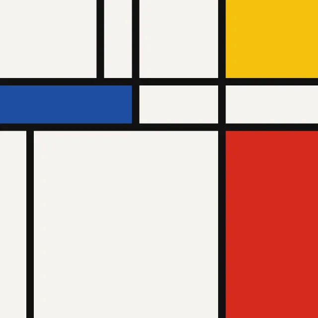
- Unmodulated areas of colour. Always.
- Very large against very small elements, for drama and order. Always.
- No pictures; type carries everything. Always.
How this generator works
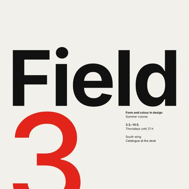
- The title word is the picture: condensed capitals drawn up tall (the stems lengthen, bars and bowls keep their weight) and set tight until they fill the sheet, in one line, stacked, cut by the edges or turned.
- Its letters, or the ground around them, are screens of straight parallel lines whose thickness steps letter by letter, grades from solid to thin or swells as a wave, so the word reads through the screen.
- One or two flat inks and the white of the paper, with a small flush-left grotesque block of facts set against the enlarged word.
What it never does:
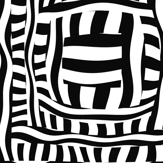
- No warped or bulging stripe fields and no word repeated line after line: one word, one screen of straight lines.
- No gradients, shading or third ink, and no known poster’s title: the default words are plain nouns chosen for this generator, and the facts are generated, never placeholder text.
- Animation thickens and thins the lines once a loop and never moves them, so no point turns from light to dark more than about once a second.
Every picture is a recipe: the variation number and the settings, kept in the page's address. Copy the link and the same picture comes back, in any browser. Random (or R) draws a new variation; ← and → step through them; S shuffles the settings; C borrows another style's colours.
About Di Tella Graphic Design (Instituto Torcuato Di Tella)
Di Tella is the name for the in-house graphics of an arts institute in Buenos Aires in the 1960s. Its posters, programmes and catalogues announced exhibitions, concerts and theatre with very little: one or two flat inks, the white of the paper, and the title of the event enlarged until it became the picture. Swiss order met the experimental art it advertised, and when the show was optical or kinetic, the letters themselves were screened with lines.
This generator works the same way. Your word is set in a condensed grotesque and drawn up tall, the stems lengthening while the bars and bowls keep their weight, then set in one line, stacked, cut by the edges of the sheet or turned to read upwards. A screen of straight lines runs through the letters or through the ground around them; its thickness steps letter by letter, grades from solid to thin, or swells as a wave, and in positive and negative the screen reverses inside the letters.
A second, spot ink can run in bands behind the lines, and a small flush-left block of facts, generated from the variation number, sits against the word. With animation on, the lines thicken and thin as a slow wave passes through the word; they never move, so nothing flickers.
Di Tella Graphic Design (Instituto Torcuato Di Tella): 1960–1970. What the controls mean: Help.
Use it from code
The recipe below draws the picture this page opens with. Copy recipe gives you the one on screen. Agents can render recipes to SVG or PNG through Morphogeny's MCP server (morphogeny_render); the same recipe always gives the same SVG.
{
  "tool": "di-tella",
  "v": 1,
  "seed": 9,
  "format": "square",
  "params": {
    "text": "",
    "layout": "line",
    "rhythm": "graded",
    "direction": "across",
    "lines": 38,
    "figure": "letters",
    "inks": "two",
    "facts": true
  },
  "palette": "di-tella-graphics"
}
Open this recipe: /di-tella/#seed=9&v=1. A plain-text version of this page:/di-tella.md.