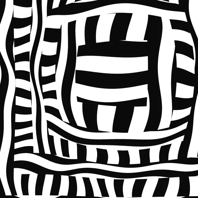
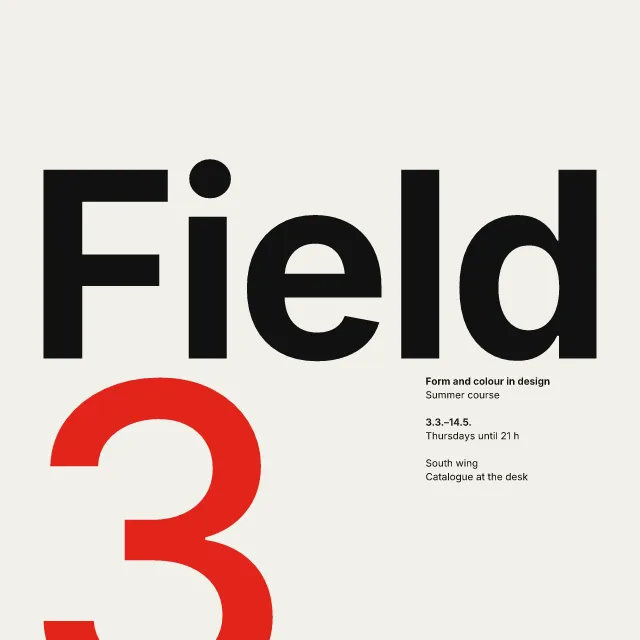
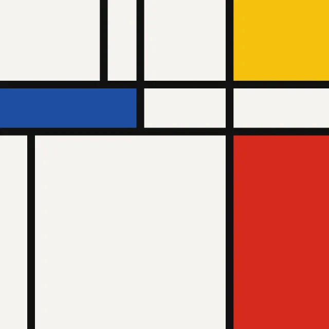
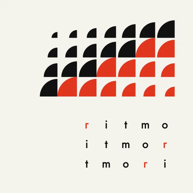
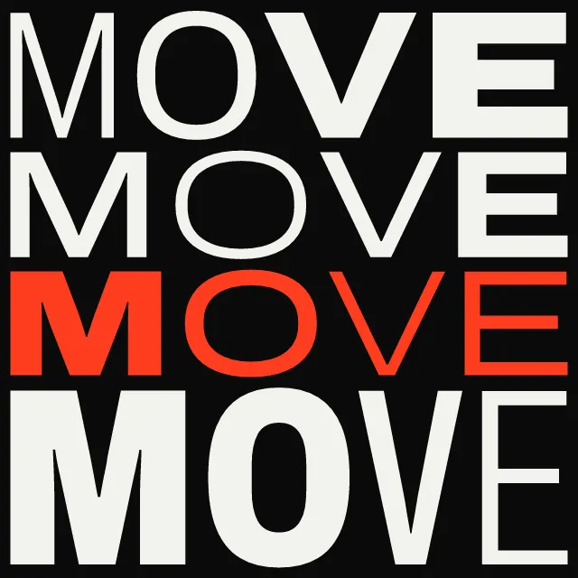
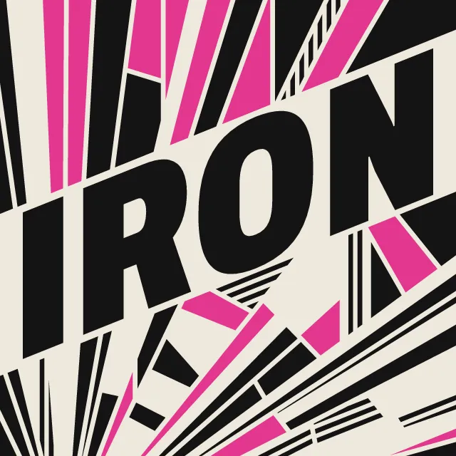
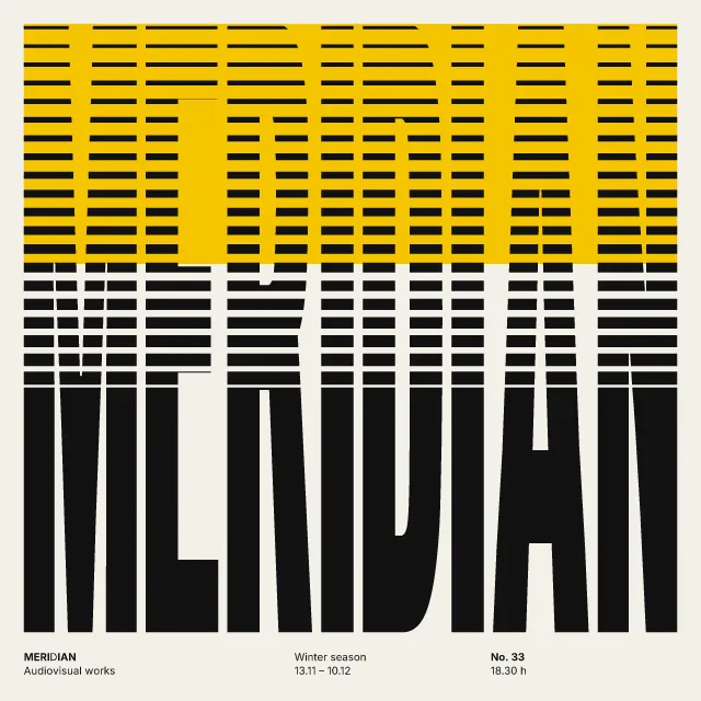
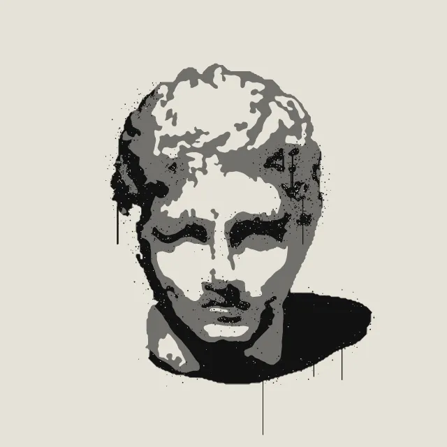
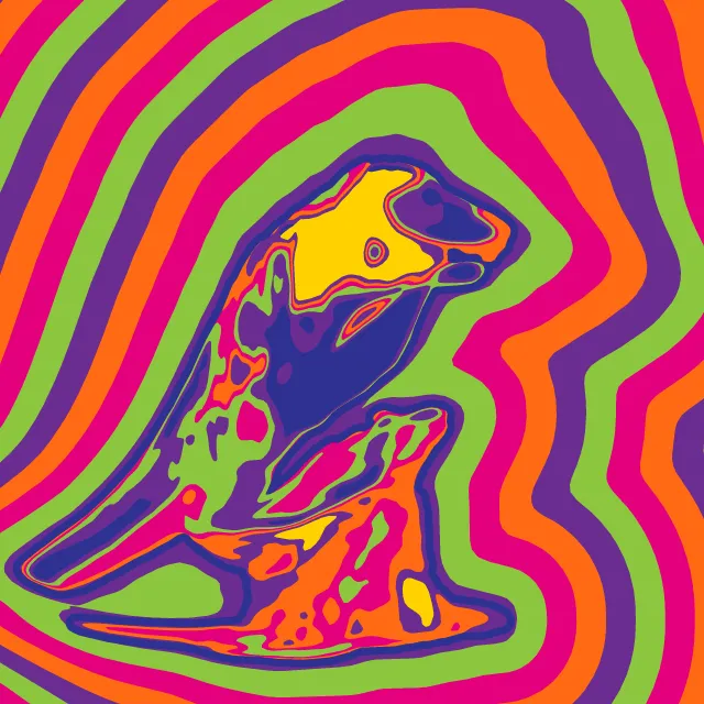
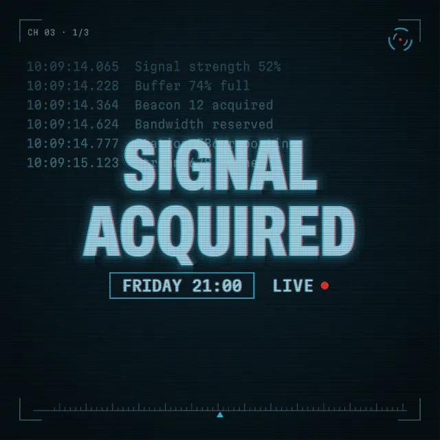
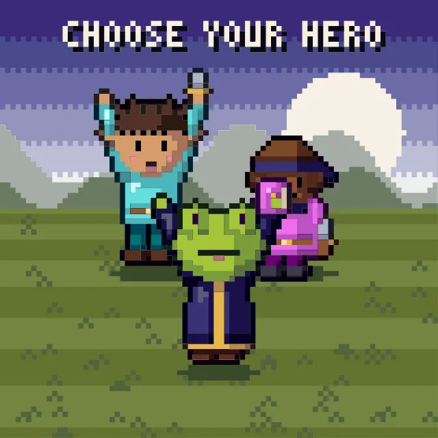
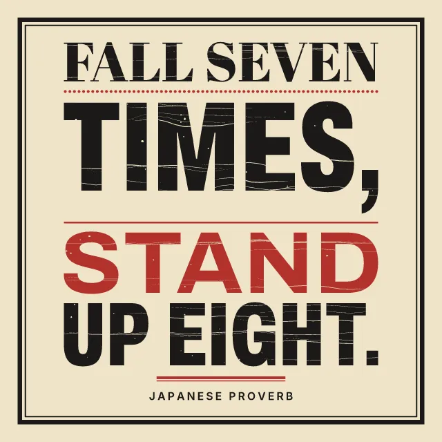
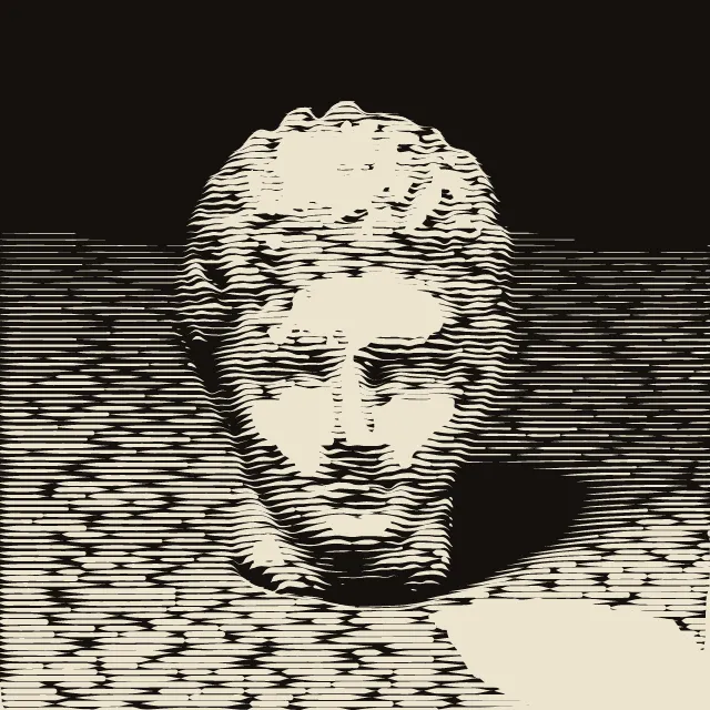
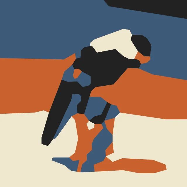
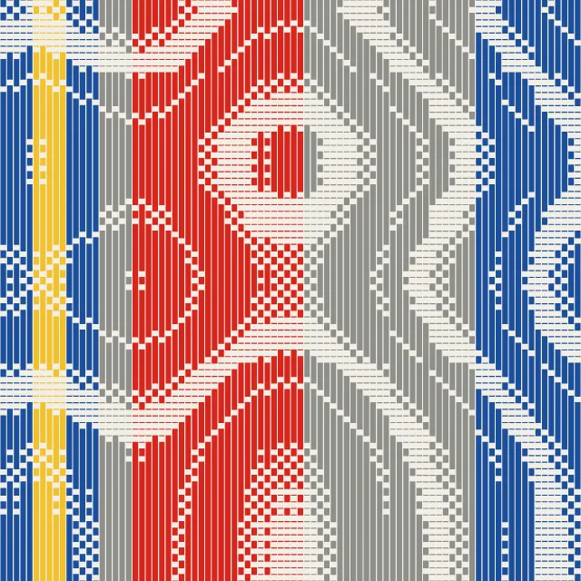
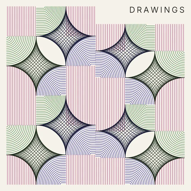
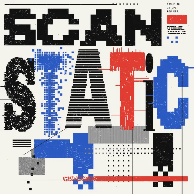
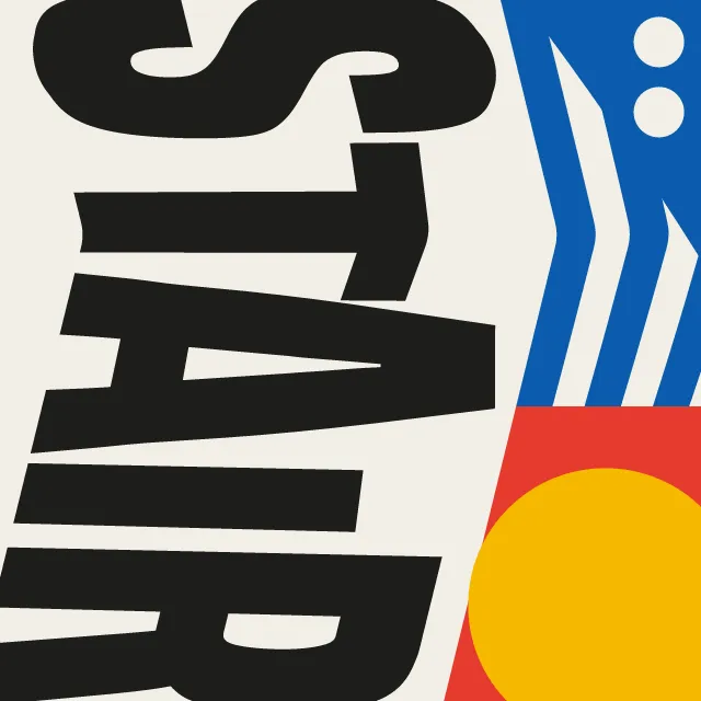
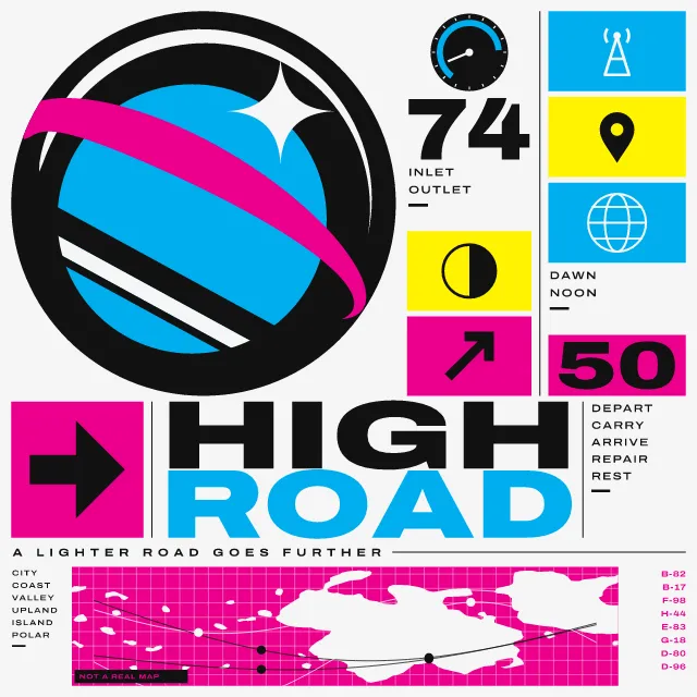
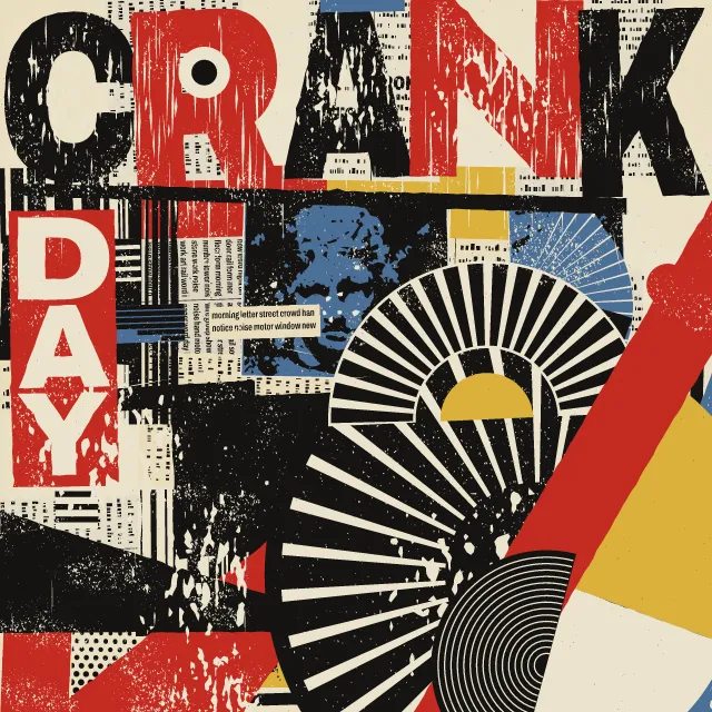
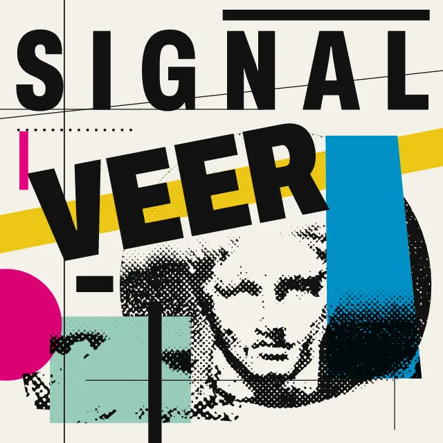
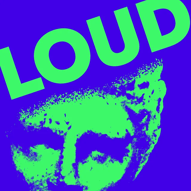
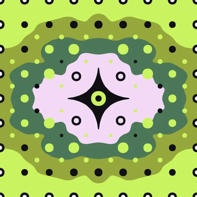
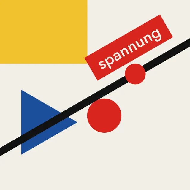
Your title in heavy condensed capitals filling the sheet, its letters bent through one field into a single optical motif, with date and bill small at the edges.
What makes it Lucerne poster
These are the design choices this generator makes or lets you set. Where a choice says “Measured”, Morphogeny changed that control alone, kept everything else, and measured the picture: a number that moves with the choice, not proof that the picture reads as the style.
- Stretched, fragmented, layered or deliberately hard-to-read letters. Set by “Distortion”.
- Elements radiate from, or orbit around, a centre. “Distortion”: Vortex.
- Perspective, overlap, shadow or parallax create a z-axis. “Distortion”: Bulge.
- Text and image follow curving, natural paths instead of a grid. “Distortion”: Ripple.
- Repeated lines and modules that vibrate or warp perception. Set by “Optical pattern”. Measured on the opening picture: pixels on an edge 14% with “None”, 25% with “Line field”, 23% with “Reversed checks”, 22% with “Echo lines” and 22% with “Cast shadow”.
- Solid, unblurred drop shadows and outlines. “Optical pattern”: Cast shadow.
- Repeated units create a visual cadence. Set by “Repetition & rhythm”. Measured on the opening picture, from 16 to 80: pixels on an edge 16% → 35%.
- A single hue, or black and white. “Colour”: Black and white. Measured on the opening picture with “Black and white”: hues besides black, white and grey 0.
- Two or three flat inks. “Colour”: Limited spot colours. Measured on the opening picture with “Limited spot colours”: hues besides black, white and grey 2.
- Letters so large they become the picture. Always.
- One unmistakable point of entry. Always.
- Tall, narrow, heavy letters for impact. Always.
- Capitals for monumentality, order or shouting. Always.
- Unmodulated areas of colour. Always.
How this generator works
- The title is the picture: heavy condensed capitals fill the sheet edge to edge, and their outlines are bent through one field (a vortex, a bulge, a ripple, slices or a fold) into a single motif.
- The optical pattern is bent by the same field as the letters, so lines, checks or echoes and the title read as one surface.
- A limit does the design work: black and white only, or a few flat inks overprinting on the lightest colour as paper; date, place and bill in small grotesque type at the edges.
What it never does:
- No pictures, no ornament and no second typeface for the title; no greys in black and white.
- No copy of any venue’s or designer’s poster: the default words are plain kinds of evening, and the edge text is generic (no real venues, names or events).
- Motion only breathes the field around its still, once a loop, so the letters never flicker; the still is the first frame.
Every picture is a recipe: the variation number and the settings, kept in the page's address. Copy the link and the same picture comes back, in any browser. Random (or R) draws a new variation; ← and → step through them; S shuffles the settings; C borrows another style's colours.
About Lucerne Poster Scene (Neubad & Südpol Posters)
Since the late 2000s the small non-commercial venues of Lucerne have commissioned a new poster for every concert and club night, and the city became known for them well beyond Switzerland. Most often the title is the picture: the letters of the band or the evening are built, twisted or warped until they fill the sheet as one motif, with op-art line fields, checkerboards and cast shadows that seem to stand out of the paper. A limit does the rest: black and white only for one venue, a few Risograph inks for another.
This generator sets your words in heavy condensed capitals that fill the sheet, then bends their outlines through one field: a vortex, a bulge, a ripple, slices that shift, or a fold. The optical pattern behind them (a line field, a checkerboard the letters reverse, echo outlines or a hatched shadow) is bent by the same field, so title and ground read as one surface. Date, place and bill sit in small grotesque type at the edges; the words there are generic, never real venues or bands. Leave the title empty and the variation number picks a plain one.
Black and white is the default; Limited spot colours lets a few flat inks overprint on the lightest colour as paper, which looks right with the Risograph misregistration pass. In motion the field breathes once a loop, slowly, and the still is the first frame. The type is Archivo, an open-source variable grotesque, held in the SVG as outlines.
Lucerne Poster Scene (Neubad & Südpol Posters): 2007–today. What the controls mean: Help.
Use it from code
The recipe below draws the picture this page opens with. Copy recipe gives you the one on screen. Agents can render recipes to SVG or PNG through Morphogeny's MCP server (morphogeny_render); the same recipe always gives the same SVG.
{
  "tool": "lucerne",
  "v": 1,
  "seed": 1,
  "format": "poster",
  "params": {
    "text": "",
    "distortion": "vortex",
    "strength": 0.6,
    "field": "lines",
    "density": 44,
    "break": "auto",
    "colour": "mono",
    "details": true
  },
  "palette": "lucerne-poster-scene"
}
Open this recipe: /lucerne/#seed=1&v=1. A plain-text version of this page:/lucerne.md.