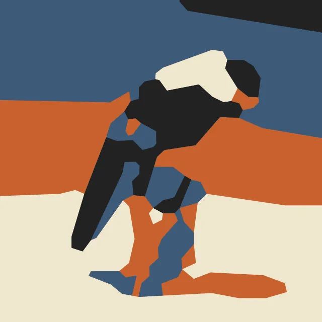
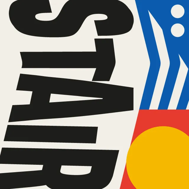
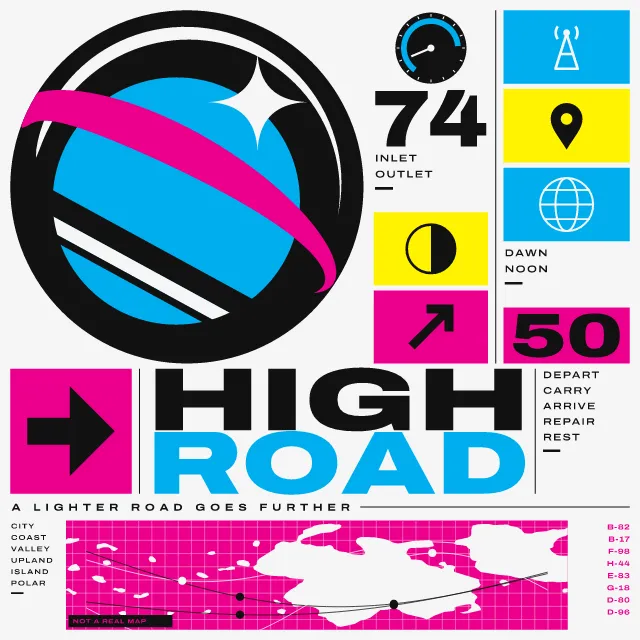
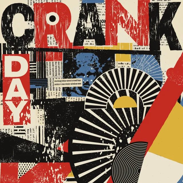
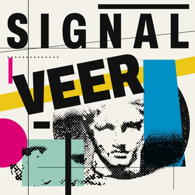
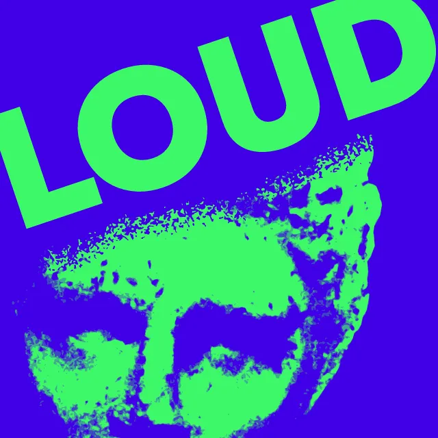
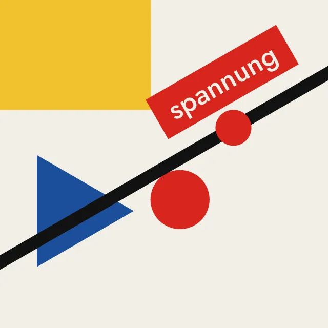
Angular planes cut as in a woodcut and fanning out from one or two vortices, with your word in heavy condensed capitals on the diagonal, or a manifesto page of lists.
What makes it Vorticism
These are the design choices this generator makes or lets you set. Where a choice says “Measured”, Morphogeny changed that control alone, kept everything else, and measured the picture: a number that moves with the choice, not proof that the picture reads as the style.
- Composition driven by tilted axes and oblique movement. “Composition”: Shards and word. Measured on the opening picture: edges on the diagonal 41% with “Shards and word”, and 15% to 38% with the other options.
- Pure form with no depicted subject. “Composition”: Shards only.
- No pictures; type carries everything. “Composition”: Manifesto page. Measured on the opening picture: large shapes 7 with “Manifesto page”, and 22 to 34 with the other options.
- Content held in borders, cartouches or compartments. “Composition”: Page with a plate.
- Lines set at angles, stacked or running vertically. “Composition”: Cover.
- One unmistakable point of entry. “Lines of force”: One vortex.
- Every area is filled; abundant, crowded, layered. Set by “Horror vacui”. Measured on the opening picture, from 0 to 1: shapes 19 → 134.
- Very large against very small elements, for drama and order. Set by “Extreme scale contrast”.
- Thick bars, lines and dots as structural accents. Set by “Rules & bars”. Measured on the opening picture, from 0 to 1: long thin shapes 14 → 20.
- A single hue, or black and white. “Colour”: Black and white. Measured on the opening picture with “Black and white”: hues besides black, white and grey 0.
- Two or three flat inks. “Colour”: Black and one hot ink. Measured on the opening picture with “Black and one hot ink”: hues besides black, white and grey 1.
- Chevrons, zigzags, sunbursts and faceted shards. Always.
- Neutral, rational sans: Akzidenz-Grotesk, Helvetica, Univers. Always.
- Capitals for monumentality, order or shouting. Always.
- Deliberate instability: crowded edges, clashes, near-collisions. Always.
- Unmodulated areas of colour. Always.
How this generator works
- The whole frame is cut into hard-edged angular planes by lines that fan from one or two off-centre vortices or run along a few dominant diagonals; every plane is parted from its neighbours by the same narrow gutter of paper, as in a woodcut or line block.
- Heavy condensed capitals stand upright on a climbing baseline as part of the structure: the edges of their band are cuts that run on through the whole frame.
- The manifesto page sets one heavy grotesque in level lines of jumping sizes, held by vertical rules, underlines, short thick bars and boxed numerals.
What it never does:
- No curves, no ornament, no gradients and no scatter: every plane is a straight-edged piece of one cut-up frame.
- No copy of any known cover or painting: the default is a picture, not a single word on a diagonal across pink, and the words are plain nouns written for this tool, never names, places or quotations.
- Lines of the manifesto stay level and still; in motion the planes and the word slide out along their rays and back, spreading from one point so that no gutter ever closes.
Every picture is a recipe: the variation number and the settings, kept in the page's address. Copy the link and the same picture comes back, in any browser. Random (or R) draws a new variation; ← and → step through them; S shuffles the settings; C borrows another style's colours.
About Vorticism & BLAST Typography
Vorticism was a short-lived movement in London in 1914 and 1915, a British answer to Cubism and Futurism. Its pictures reduced machines, docks and cities to hard-edged angular planes, cut in wood or drawn for line blocks and printed in flat black and white, sometimes with one loud colour. Its magazine set manifestos in a heavy jobbing grotesque: huge words, lists of things to attack and to praise, and level lines whose sizes jump from shouting capitals to small asides.
This generator cuts the whole frame into planes. One or two vortices, placed off centre by the variation number, send out spokes; the planes are then split again along the rays, across them, along two crossing diagonals or upright, so that fans, bands and stepped blocks appear. Every plane keeps the same narrow gutter of paper from its neighbours, as in a woodcut, and is black, the hot ink, paper or a run of machine-part rules. Your word stands on the main diagonal: the letters stay upright while the baseline climbs, and the edges of their band run on as cuts through the picture. Leave the heading empty and the variation number picks a plain noun, such as Iron, Crane or Forge.
The manifesto page sets your word as a huge heading over two lists in level lines of jumping sizes, held by vertical rules, underlines, short thick bars and boxed numerals; the words of the lists are plain nouns written for the generator, not quotations. You can also give the page a picture plate, or make a cover with one title across a field of hot ink. In motion the planes and the word slide out along their rays and back once a loop, without closing a gutter; the manifesto’s lines stay still. The type is Archivo, an open-source variable grotesque, held in the SVG as outlines.
Vorticism & BLAST Typography: 1914–1920. What the controls mean: Help.
Use it from code
The recipe below draws the picture this page opens with. Copy recipe gives you the one on screen. Agents can render recipes to SVG or PNG through Morphogeny's MCP server (morphogeny_render); the same recipe always gives the same SVG.
{
  "tool": "vorticism",
  "v": 1,
  "seed": 1,
  "format": "portrait",
  "params": {
    "text": "",
    "composition": "picture",
    "force": "one",
    "angle": 22,
    "density": 0.5,
    "contrast": 0.6,
    "rules": 0.5,
    "colour": "spot"
  },
  "palette": "vorticism"
}
Open this recipe: /vorticism/#seed=1&v=1. A plain-text version of this page:/vorticism.md.