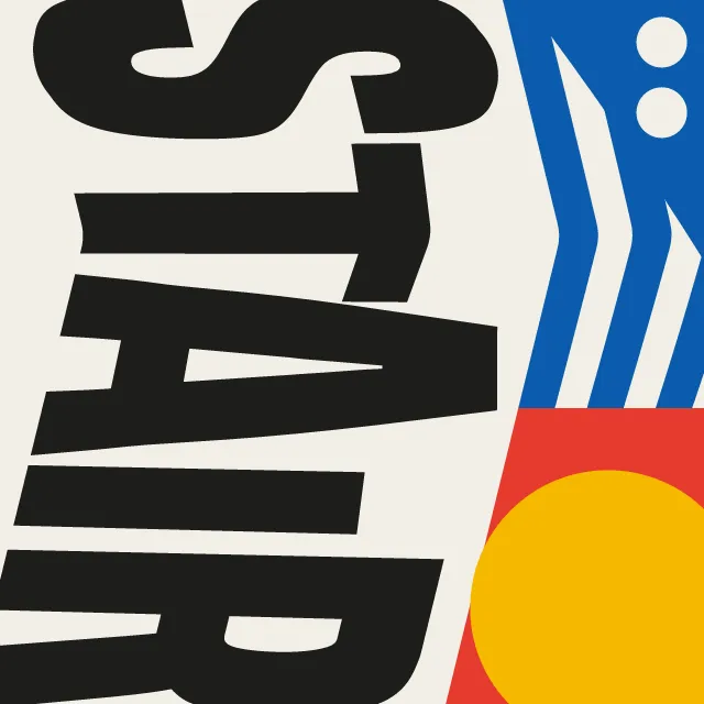
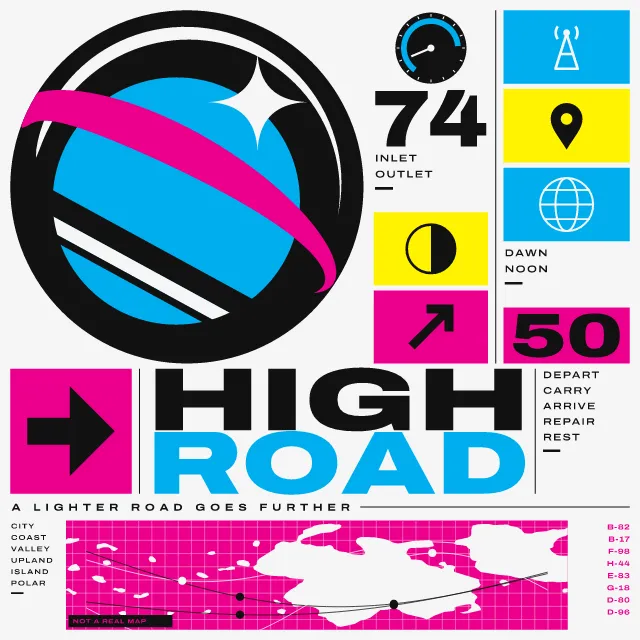
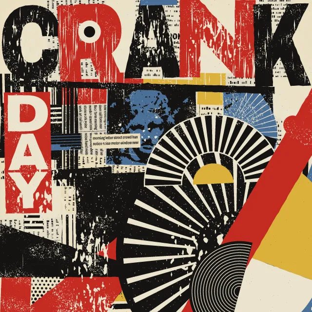
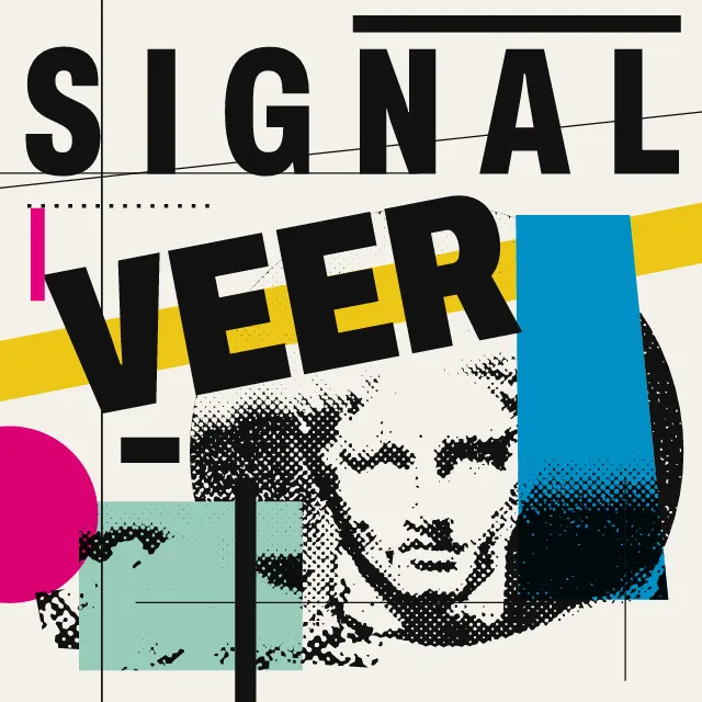
Two words of your own, cut into coarse pixels and damaged one letter at a time, over a loose heap of print modules on a cheap, uneven print.
What makes it Lo-res magazine
These are the design choices this generator makes or lets you set. Where a choice says “Measured”, Morphogeny changed that control alone, kept everything else, and measured the picture: a number that moves with the choice, not proof that the picture reads as the style.
- Letters constructed on a pixel grid. Set by “Bitmap & pixel”.
- Corrupted pixels, scanlines, compression artefacts. Set by “Glitch”.
- Many typefaces and sizes combined in one composition. Set by “Eclectic mixing”.
- Every area is filled; abundant, crowded, layered. Set by “Horror vacui”. Measured on the opening picture, from 0 to 1: shapes 145 → 156.
- Two or three flat inks. Set by “Limited spot colours”.
- A single hue, or black and white. “Limited spot colours”: Black and grey. Measured on the opening picture with “Black and grey”: hues besides black, white and grey 0.
- Light elements on black or deep fields. “Limited spot colours”: Negative. Measured on the opening picture with “Negative”: brightness of the ground 0.6%.
- Stretched, fragmented, layered or deliberately hard-to-read letters. Always.
- Letters so large they become the picture. Always.
- Overlapping fragments, cut-outs and stacked planes. Always.
- A grid is implied and then deliberately violated or deconstructed. Always.
- Thick bars, lines and dots as structural accents. Always.
- Early Mac/PC layout, bitmap fonts and PostScript. Always.
How this generator works
- Two words fill the top of the sheet edge to edge, each letter cut from a heavy outline into coarse pixels and given a damage of its own.
- Under them, a loose heap of print modules: flat blocks, screened greys, checkers, stripes, dot grids and rules, in one of seven arrangements.
- The print is uneven: patches of flecks and dry streaks run across the inks, and grey is never flat.
What it never does:
- No bitmap font: the steps come from shrinking a heavy outline, so verticals stay long and clean and only curves and diagonals stair.
- No gradients, soft shadows or colour mixing, and no photographs. Colours stay flat, except that a screen can sit over an ink.
- No masthead, logo or layout copied from any real magazine; the words are the only type, with at most a three-line technical colophon.
Every picture is a recipe: the variation number and the settings, kept in the page's address. Copy the link and the same picture comes back, in any browser. Random (or R) draws a new variation; ← and → step through them; S shuffles the settings; C borrows another style's colours.
About Lo-res editorial
When the first desktop computers reached designers in the mid-1980s, screens and printers could only draw in coarse pixels. One strand of editorial design took that as material rather than as a fault: letters built from the grid, many treatments on one page, rules and blocks piled loosely, and little colour beyond black and a spot or two.
This generator cuts each letter from a heavy outline by shrinking it, so verticals stay long and clean and only curves and diagonals stair. Then each letter gets its own damage: bands that slip, squares that come away, scan lines, mosaic, dry streaks, eaten edges. Type any two words: long ones break over two lines, and short ones stand to one side and leave room for more print.
Under the words sits one of seven arrangements of flat blocks, screened greys, checkers, stripes and dot grids, and over everything run hairlines and patches where the ink did not take. In motion it moves in hard steps, four a second: bands slip and return, and squares break away and travel, always back to the same still.
Lo-res editorial: 1984–1998. What the controls mean: Help.
Use it from code
The recipe below draws the picture this page opens with. Copy recipe gives you the one on screen. Agents can render recipes to SVG or PNG through Morphogeny's MCP server (morphogeny_render); the same recipe always gives the same SVG.
{
  "tool": "lo-res",
  "v": 1,
  "seed": 15,
  "format": "portrait",
  "params": {
    "first": "TYPE",
    "second": "ERROR",
    "coarse": 1,
    "damage": 0.5,
    "mix": "many",
    "density": 0.5,
    "roles": "spots",
    "effect": "both"
  },
  "palette": "emigre"
}
Open this recipe: /lo-res/#seed=15&v=1. A plain-text version of this page:/lo-res.md.