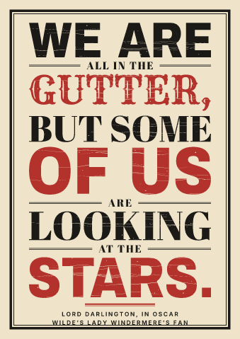
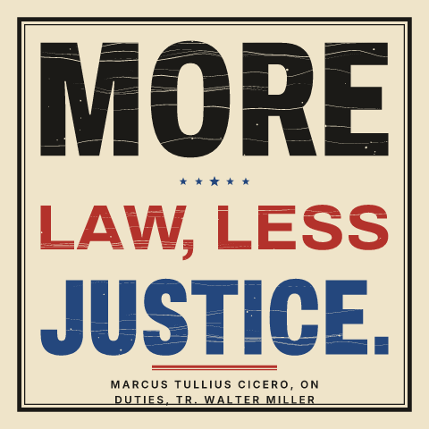
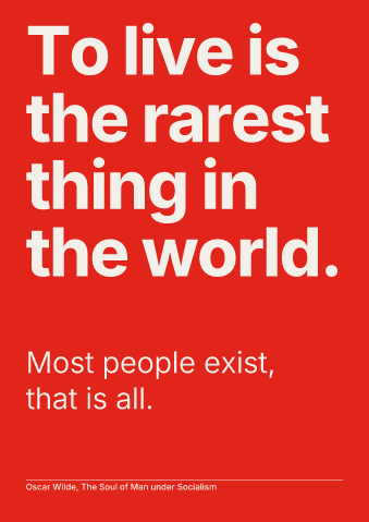
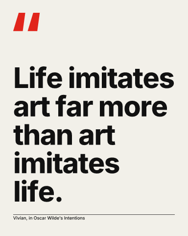
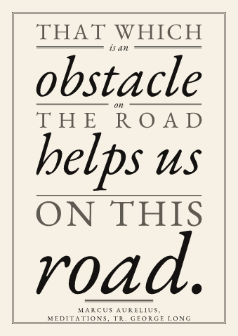
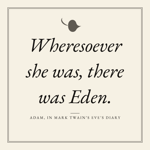
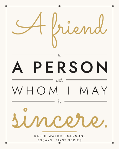
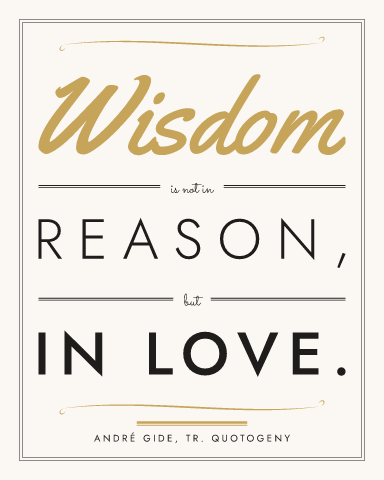
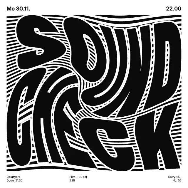
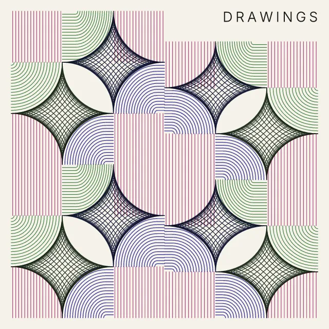
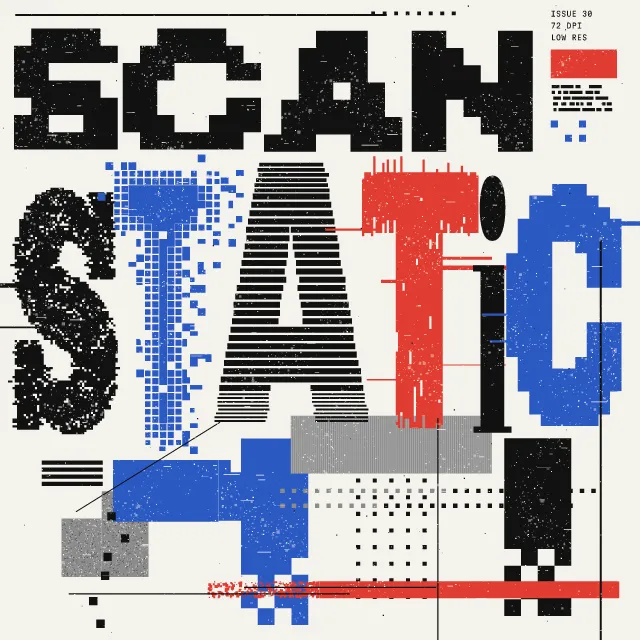
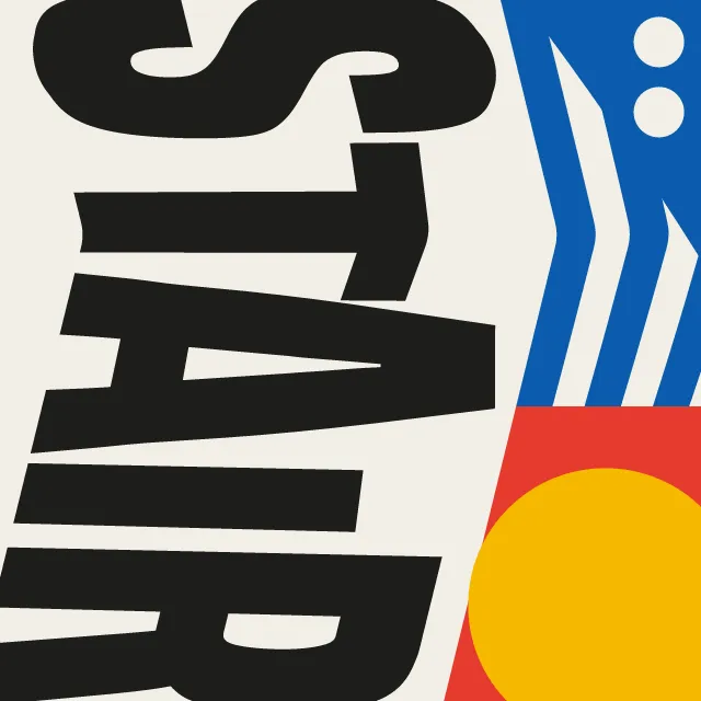
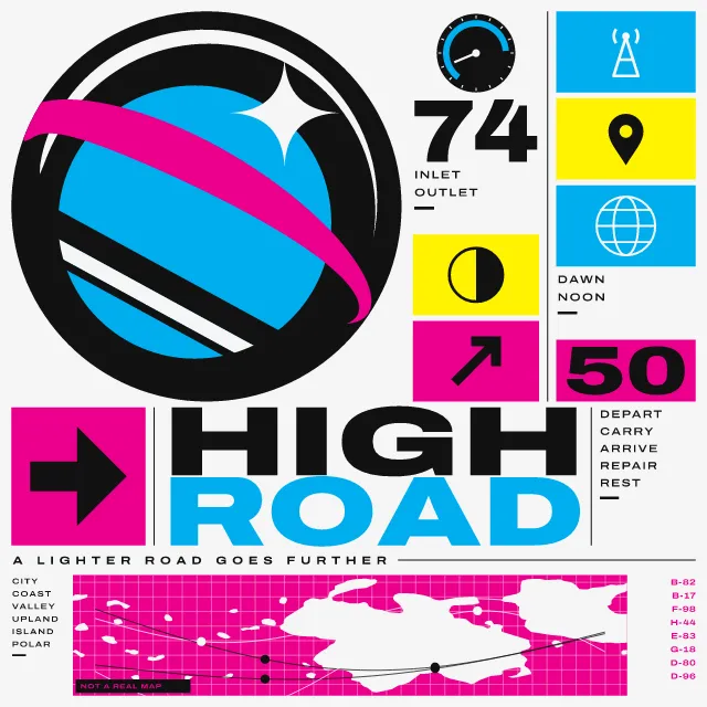
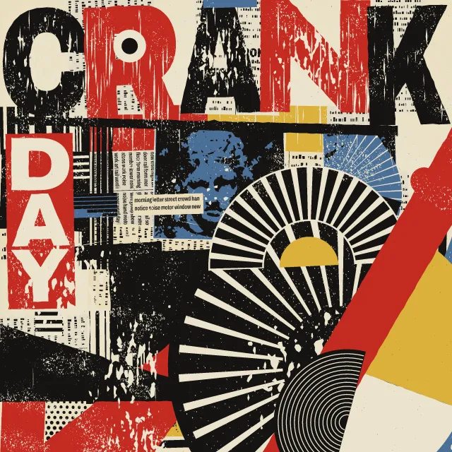
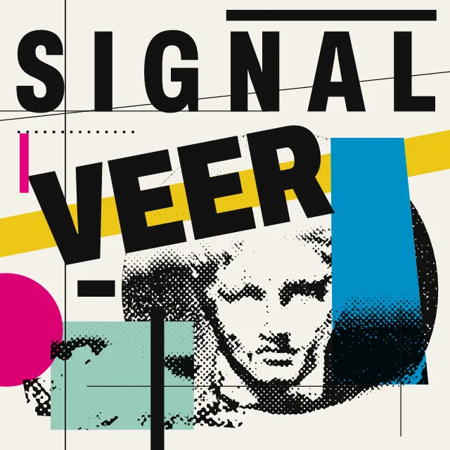
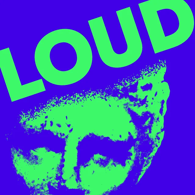
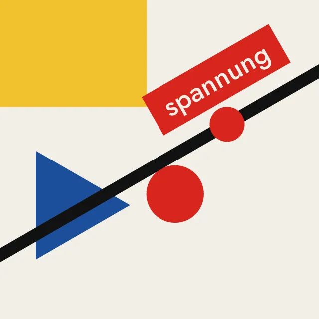
Type a quote or pick a genuine one, then set it in one of ten typographic styles, each with its own faces, layout and colours.
What makes it Quote poster
These are the design choices this generator makes or lets you set. Where a choice says “Measured”, Morphogeny changed that control alone, kept everything else, and measured the picture: a number that moves with the choice, not proof that the picture reads as the style.
- Metal and wood type printed in relief. “Style”: Letterpress.
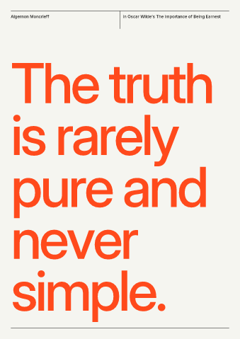
- Asymmetric, unjustified text setting. “Style”: Swiss.
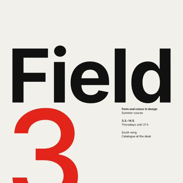
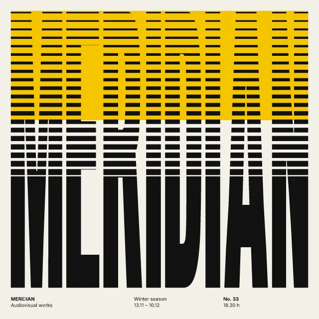
- Letters and lines crowded together, touching or overlapping. “Style”: Neo-Swiss.
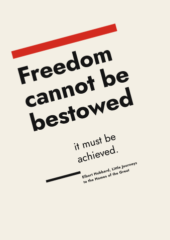
- Off-centre balance from the tension between unequal masses. “Style”: New Typography.
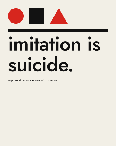
- Capitals rejected as unnecessary. “Style”: Bauhaus.
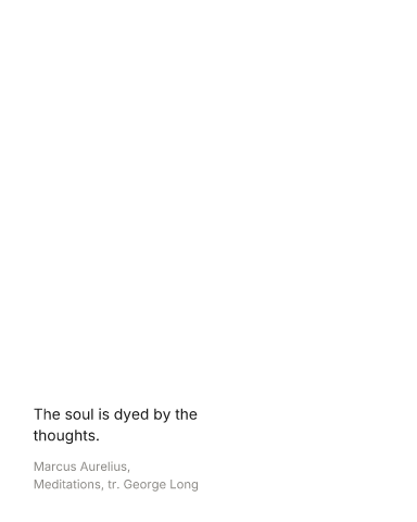
- Emptiness is an active element: wide margins and quiet areas. “Style”: Minimal. Measured on the opening picture: ground showing 99% with “Minimal”, and 65% to 95% with the other options.
- Calligraphic stress and bracketed serifs: Jenson, Garamond, Bembo. “Style”: Book page.
- Calligraphy as structure: Arabic, East Asian, broad-pen Latin. “Style”: Brush script.
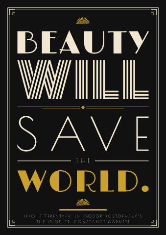
- Inline, shaded, Tuscan or fantasy display faces. “Style”: Art Deco.
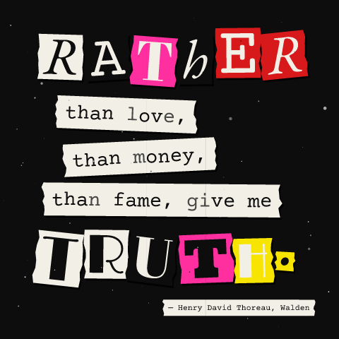
- Xerox and other cheap reproduction. “Style”: Zine.
- Airy, generously spaced letters, usually capitals. “Page”: Title page.
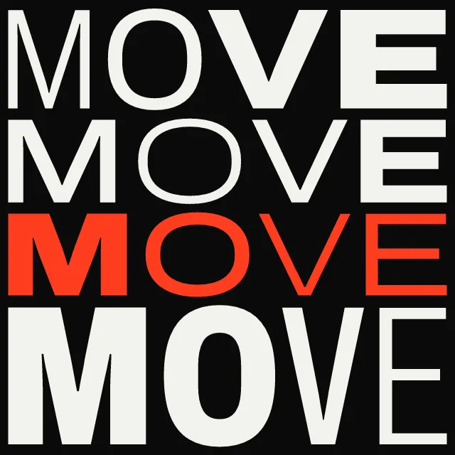
- Many typefaces and sizes combined in one composition. Set by “Eclectic mixing”.
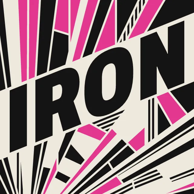
- Tall, narrow, heavy letters for impact. “Eclectic mixing”: Gothics.
- Very large against very small elements, for drama and order. Set by “Extreme scale contrast”.
- Two or three flat inks. Set by “Limited spot colours”.
- A single hue, or black and white. “Limited spot colours”: One ink. Measured on the opening picture with “One ink”: hues besides black, white and grey 0.
- Decorative frames, cartouches and rules around content. Set by “Borders & frames”. Measured on the opening picture: ink at the edges 3.4% with “None”, 6.3% with “Rule”, 18% with “Double” and 24% with “Ornate”.
- Thick bars, lines and dots as structural accents. Set by “Rules & bars”. Measured on the opening picture: long thin shapes 15 with “None”, 20 with “Some” and 20 with “Every line”.
- Solid, unblurred drop shadows and outlines. Set by “Hard offset shadow”. Measured on the opening picture, off to on: area in near-black 24% → 26%.
- Visible fibre, impression and ink spread. Set by “Paper & letterpress bite”. Measured on the opening picture, from 0 to 1: fine grain (an index) 31 → 41.
- No pictures; type carries everything. Always.
- Letters so large they become the picture. Always.
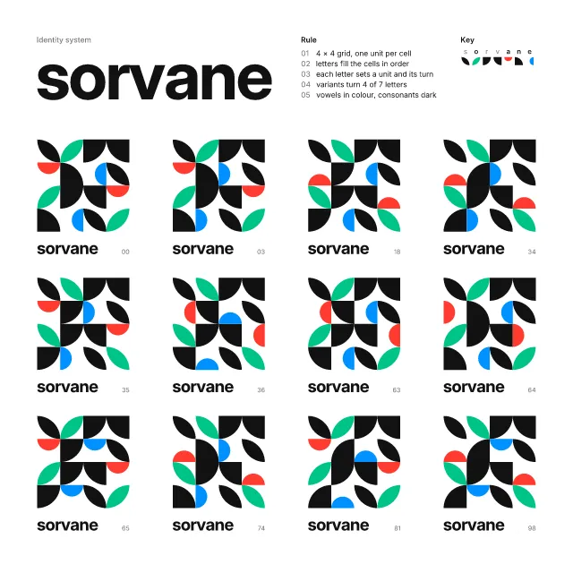
- Unmodulated areas of colour. Always.
How this generator works
- The quote is the whole poster, set by the rules of one typographic style: wood type centred and driven out to the measure line by line; Swiss flush left on a grid; Neo-Swiss huge and tight under an index of hairlines; New Typography in black and red on heavy bars, on a diagonal or down a side; Bauhaus in lowercase under a circle, a square and a triangle; Minimal small on one grid point of an empty sheet; a book page with classical margins; brush script for the key words; Art Deco capitals with chevrons and fans; typed strips and cut-out letters on a zine page.
- Line breaks are chosen, not left to chance: key words get a line to themselves, small words drop to connectors, running text is balanced and no line ends on a small word it should lead into the next.
- Each style opens with its own colours from the atlas; any palette can replace them.
- In motion, the poster sets itself line by line in its style’s manner and in a reading rhythm, then holds; the still is the finished poster, and the loop may begin on it or on the empty sheet.
What it never does:
- No pictures: only type, rules and ornament.
- No famous poster, title page or record sleeve: the words are the visitor’s, and an empty quote takes an old proverb.
- Quotes offered from Quotogeny are genuine and public domain, credited with their work and, for a translation, the translator.
Every picture is a recipe: the variation number and the settings, kept in the page's address. Copy the link and the same picture comes back, in any browser. Random (or R) draws a new variation; ← and → step through them; S shuffles the settings; C borrows another style's colours.
About Victorian Letterpress & Wood Type
A quote poster lives or dies by its typesetting: where the lines break, which words grow, what holds the page together. This generator sets your words by the rules of ten styles from the Stylogeny atlas. Letterpress drives every line out to the full width in a different wood type, as a jobbing printer did. Swiss sets the quote flush left on a grid, as big as it will go, and four more modernist styles keep as spare by other rules: Neo-Swiss sets it huge and tight in one weight under an index of hairlines; New Typography builds the page on heavy bars in black and red, the block turned on a rising diagonal or hung from a bar down the side; Bauhaus sets it in lowercase under a circle, a square and a triangle; Minimal sets it small on one point of the grid and leaves the rest of the sheet empty. Book page sets it as an epigraph, an opening with a drop initial, or a title page. Brush script writes the key words and spaces out the rest in capitals. Art Deco stacks contrasting capitals between chevrons and fans. Zine types it on torn strips and cuts the key words out of other print.
Line breaks are chosen, not left to chance: key words get a line to themselves, small words such as "of the" drop to a connector, running text is balanced so no line is left short, and no line ends on a word that should lead into the next. A new line in the quote box starts a new line on the poster.
You can pick a quote instead of typing one: the list holds genuine quotes from Quotogeny, each traced to the page it comes from, from works in the public domain, and credited with the work and, for a translation, the translator. Each style opens in its own colours from the atlas; turn them off to use any palette. The type is open-source and held in the SVG as outlines.
Press play and the poster sets itself, line by line in reading order, the way its style would: wood type pressed into the paper, Swiss lines sliding in from the margin, Neo-Swiss lines rising from their baselines, a book page inking in, script written out, Art Deco capitals rising into place, and zine letters slapped down in stop motion. The loop begins on the empty sheet: each line arrives as the one before lands, key words after a short beat, then the finished poster holds for reading. Shorten the loop and the quote sets faster; lengthen it and it holds longer. Begin on the written poster instead if you like, and save it as a video for a story or a post.
Victorian Letterpress & Wood Type: 1810–1900. What the controls mean: Help.
Use it from code
The recipe below draws the picture this page opens with. Copy recipe gives you the one on screen. Agents can render recipes to SVG or PNG through Morphogeny's MCP server (morphogeny_render); the same recipe always gives the same SVG.
{
  "tool": "quote-poster",
  "v": 2,
  "seed": 6,
  "format": "poster",
  "params": {
    "quote": "Fall seven times, stand up eight.",
    "source": "Japanese proverb",
    "style": "letterpress",
    "own": true,
    "page": "epigraph",
    "hand": "brush",
    "faces": "mixed",
    "contrast": 0.6,
    "colour": "one",
    "border": "double",
    "rules": "some",
    "shadow": false,
    "wear": 0.45,
    "begin": "empty"
  },
  "palette": "victorian-letterpress"
}
Open this recipe: /quote-poster/#seed=6&v=2. A plain-text version of this page:/quote-poster.md.